Ever heard the saying “you’re your own worst client?”
In our industry it’s common knowledge that a DYO (or “Design Your Own“) website is one of the trickiest things a web/interactive/design company can undertake.
First of all, paid work always comes first. So despite your best efforts the DYO falls by the wayside, only to just get going again before another paid job sweeps everyone off their feet.
Then you have internal wrangles – we are all “the client” – as well as “the experts” – as well as, well, “everything else!”
So that’s why the Click Suite website redesign, in dribs and drabs, took around 12 months.
I led the Strategy and Information Design.
Here’s a reminder of what the old site looked like:

Where it got to now isn’t a happy accident…
BASED ON A STRATEGY
Click Suite decided to ‘walk the talk’ and kicked-off the DYO process by working with me to create their own Interactive Strategy’.

The Strategy included:
- A vision statement for the company.
- An analysis of where we believe Click Suite sit in the marketplace (and where they want to get to).
- Profiles of their diverse target audience, their goals (and how Click Suite will meet them).
- How Click Suite will measure the success of the new website.
You can design a website or interactive without a strategy, but having one makes the intention of the website more focused and with purpose.
Here’s what it looked like…
VISION
So why have a website? Is it just an online brochure? A portfolio? A place for people to find our email address? Well, all of those, but what makes it special?
Click Suite’s vision statement was about making it clear that they do (great) interactive media and want to “wow!” people with their work and ideas.
MARKET DIFFERENTIATORS
Click Suite picked six similar companies in NZ and I conducted a competitive analysis (based on each company’s website presence).
It was clear that the Click Suite website (built over six years ago) was showing its age. Most of its competitors had freshly designed websites. But despite this, in terms of content and services, all the websites felt fairly similar.
WHERE THEY CAN BE DIFFERENT
It’s tempting to be different just for the sake of it, but in some cases it’s OK to be like everyone else. For example, it is important to establish to the user they are in the right place and what they can expect to find, so the new website has an upfront explanation of what Click Suite does.
I also identified areas where Click Suite can be a little bit different and where they could be very different from the competition.

TARGET AUDIENCE
Who will visit the website? Click Suite works closely with their customers every day so already had a good understanding of their audience.
Industries they frequently work with include Museums, Government, Business, Ad Agencies and Software/Web companies. The roles of the people inside these companies include Curators, Communications Managers, Marketing Managers and Ad Agency executives.
Their ideal client is someone prepared to try something new. They want their business/offering to stand out from the crowd. Typically the Managing Director of a company, this person organises and takes responsibility for the effective operation of their organisation as well as its overall strategic direction.
GOALS
I listed the questions customers were likely to ask (in their heads) when they visit the Click Suite website.
For example:
- Who is Click Suite?
- So, what do they do?
- Who have they worked with?
- What does their work look like?
- How does it stack up against the best?
- OK, so lots of awards, but how has their work been successful? (for their clients).
- Can I trust this company to deliver?
The website attempts to answer all these questions.
SUCCESS MEASURES
How will Click Suite know their redesign has succeeded?
Here’s a few of the factors I recommended they measure:
- You get inquiries via the website.
- Engagements for work via website referrals.
- People say ‘I saw that on your website’.
- Subscriptions to their newsletter.
- They get comments on their blog.
I also measured success by conducting usability testing on our site and monitoring usage statistics. One such measurement is Google PageRank.
The old Click Suite website had average visibility on Google with a PageRank of five. To ensure good exposure in New Zealand a ranking of six is desirable, and for international a rank of seven or higher.
I’m happy to report that the new site now ranks a six. Their latest goal is to get to a seven (the same as Trade Me).
PROMOTION
The old Click Suite website had a small foot print’ on the web with average visibility. I changed their thinking to view the website as part of a much wider network- the world wide web.
You’ll now also find Click Suite on twitter, Vimeo and LinkedIn.
CONCEPTUAL DESIGNS
Click Suite set its designer loose on some early concepts. The themes were ‘play’, ‘learn’ and ‘explore’.

ROADMAP
The roadmap is like a high-level plan split into three stages of work. Each stage has a focus- with an explanation of how it will add value to both the business and customers.
The focus of the first stage was to show that ‘Click Suite has got great ideas’. Future phases intend to add more detail about Click Suite’s team and services and provide the ability for visitors to add their own contributions to the website.
INFORMATION DESIGN
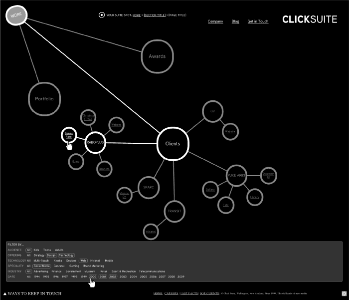
The Information Design started with the concept of allowing the user to switch between different modes of navigation (Relationship, Pictures, Text).
Here’s an early concept for the ‘relationship’ mode…

But Click Suite decided this was too ambitious with the limited time and people available, so ‘Plan B’ kicked in.
Plan B focused more on the portfolio viewer- which allows you explore projects in sequential order or filter the portfolio to view projects within a certain industry (e.g. Museums) or technology (e.g. Touchscreens).

VISUAL DESIGN
The visual design had to showing off Click Suite’s work as well as complement a variety of visual styles ranging from 1995 to the present.
The swirly animations help guide your way through the new website – these were hand-drawn and are now extending their way into our document templates, presentations and, eventually, our business cards.

DEVELOPMENT
If you’re technically inclined you might notice that the website is created in Adobe Flash, but it acts a lot like an HTML website!
The back button remembers where you’ve been, you can bookmark specific pages and lots of other clever stuff invisible to the naked eye.
USABILITY TESTING
Here are the results of the first round of usability testing on a working prototype of the website.
We tested the site with both staff and customers – setting them tasks followed by a questionnaire to gauge their impressions. We then worked to fix the issues and move the green line to a rating of four and above.

THE RESULT
So how did Click Suite go with the DYO?
Only time will tell and Click Suite would love your feedback!
While it was tempting to design a wildly creative website with whacky navigation and hidden content, the new website mixes a bit of the traditional with a bit of the new.
The site is visually rich, but still looks and acts like a website. The large portfolio images can be presented in a variety of formats- still images, animation or video.
The case study text underneath each project has the flexibility to change and extend over time. For example, in future we plan to add cross-links to related projects and technologies.
Check it out…
- Extensive work portfolio (Tip: to move through the portfolio you can click the on-screen arrows or use the left and right arrows on your keyboard)
- Some fabulous ideas
- Dozens of awards
- Top notch services
- About the company, its people and how their clients have benefited from working with them
- Where to find Click Suite and keep in touch
Still coming… (sometime in 2010)
- HTML version of the website (for the few organisations which block Flash).
- SmartPhone version.
- Ability to filter projects by client.
You must be logged in to post a comment.