Infographics
-
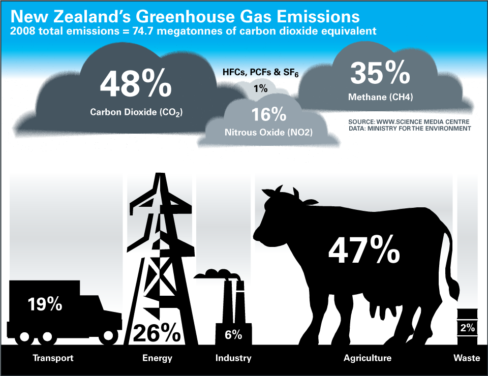
Milking the Climate
The above infographic was created for the Science Media Centre to coincide with the launch of the revised New Zealand emissions trading scheme (ETS) which came in to effect last July. New Zealand emissions have grown by over 20% above 1990 levels. The ETS is a first attempt to price carbon dioxide and other greenhouse
-
The Money In Mining
In March 2010, New Zealand’s Energy and Resources Minister Gerry Brownlee and Conservation Minister Kate Wilkinson released a discussion paper containing a suite of measures to facilitate development of New Zealand’s mineral estate – this included minerals within national parks, wildlife sanctuaries, marine reserves and protected islands. The Standard argued that the figures for mining
-
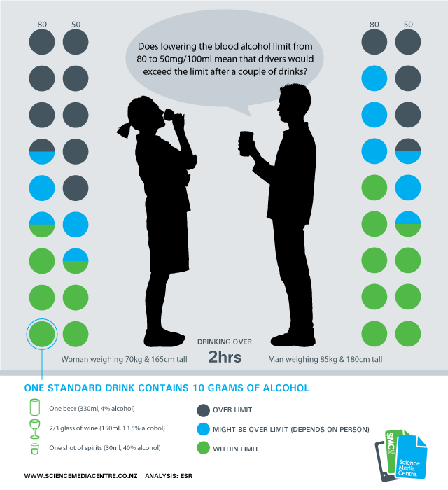
50 vs. 80
[+] Enlarge The above infographic is the first I’ve created for the Science Media Centre. Their aim is to promote accurate bias-free reporting on science and technology by helping the media to work more closely with the scientific community. The Story Behind the Infographic The New Zealand Government is considering a proposal to drop the
-
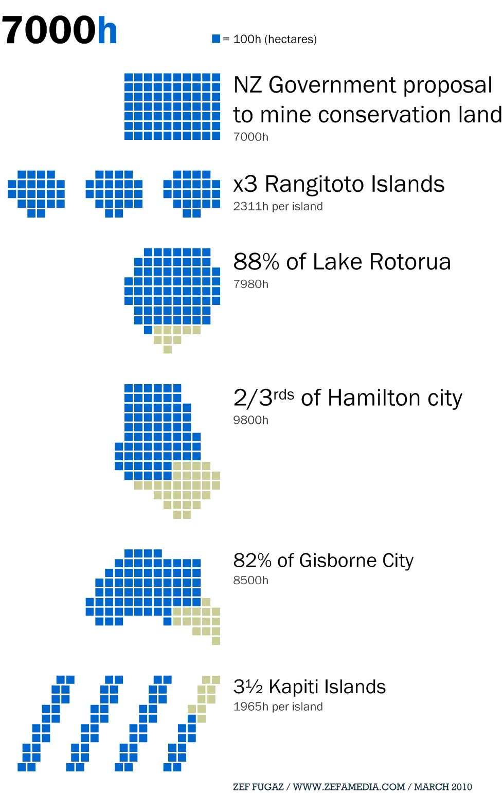
7000h
-

I Like Visuals
Here’s some of the information graphics I created in 2009 while working at Click Suite. These featured in various reports such as online strategies and concepts. I started to experiment a bit more, beyond the usual bar-graph, but I have a long way to go before I’m in the same league as the visualisation gurus
-
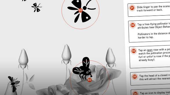
Tap Dancing on Paper
When it comes to creating a user experience specification for a website, it\’s usually a straight forward exercise. You create wireframe diagrams and show the web pages in different states. But how do you specify user interactions for a touch-screen that\’s ever-changing, highly interactive and has unpredictable curious creatures influencing the user navigation? This was
-
Tsunami Early Warning Information Graphic
When the recent 6 metre tsunami hit the Samoan region, killing 189 people, there unfortunately wasn’t time to warn their people. But there was time to warn their neighbours in the South Pacific. We failed. New Zealand had several hours to crank-up the tsunami warning machine. The police did their best to round up
-
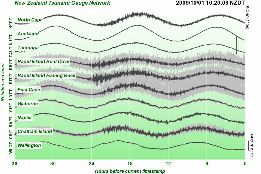
Tsunami of Confusion
The information graphics created to inform people on the Samoan tsunami about to hit New Zealand didn’t send a clear message. When disaster hits it spreads on the internet like wildfire. But the information graphics the public are served up are next to useless for making an informed decision on whether or not you’re in
You must be logged in to post a comment.