Websites
-
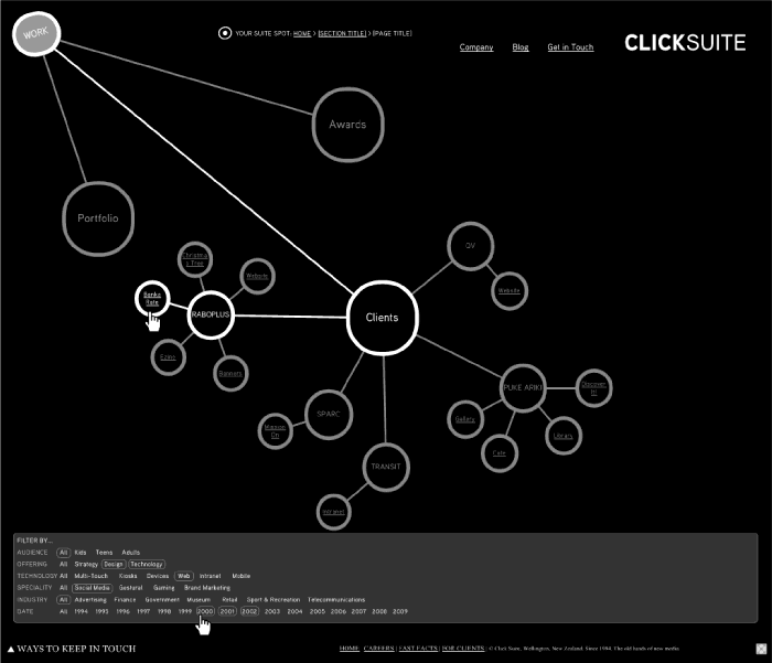
A Suite Makeover
Ever heard the saying “you’re your own worst client?” In our industry it’s common knowledge that a DYO (or “Design Your Own“) website is one of the trickiest things a web/interactive/design company can undertake. First of all, paid work always comes first. So despite your best efforts the DYO falls by the wayside, only to
-

Tsunami Early Warning Information Graphic
When the recent 6 metre tsunami hit the Samoan region, killing 189 people, there unfortunately wasn’t time to warn their people. But there was time to warn their neighbours in the South Pacific. We failed. New Zealand had several hours to crank-up the tsunami warning machine. The police did their best to round up
-

Card Sorting Doesn’t Cut the Custard
Why I don’t use Card Sorting Card sorting is a simple technique in User Experience Design where a group of users are guided to arrange subject-headings under pre-determined categories or into groups which make sense to them. For example, a card labelled “apples” might logically sit under a category labelled “fruit”. It can be
-
It’s Semantic
Throughout 2009 you’ll probably hear a lot of talk about the semantic web, aka “Web 3.0”. The semantic wave embraces previous stages of internet growth. The first stage, Web 1.0, was about connecting information and getting on the net. Web 2.0 is about connecting people – the web of social networks and participation. This was
-
Free UX Templates
Just over a year ago I took part in an amazing team competition called FullCodePress to build a website from the ground-up in 24hrs. Read all about it Since then I’ve had numerous requests from User Experience professionals around the world for copies of my information architecture templates and artifacts.
-
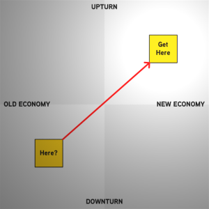
What’s Your Strategy for the Downturnaround?
The seeds of the next big thing are being planted now. Are you getting ready to turn the downturn into an upturn? No-one yet knows what the new economy will look like, but one thing is for sure, 2009 is going to be pretty turbulent. This is why it’s crucial to know your customers and
-

leftovers
It has been about six months since I changed jobs and now some of the projects my old team were working on at the time have started going public… This was my last mini-project during my last week at Provoke (ironic since I don’t eat meat!). I did the Information Architecture and Alastair Bruerton the
-
blogger blogs blogging
I’ve been contemplating if I should ditch my blog and vanish. What do you think? While my blog subscribers have halved in the past year, the other statistics indicate this (niche) site is still reasonably popular, attracting over 100,000 unique visitors in the past 12 months. So, I know you’re out there and I’d love
-
Search Engine Not Starting!
I’m working on a new information architecture for a transport-related website. I’m presenting the first cut tomorrow and wondering if this one will get past the critics… Wouldn’t it be nice to see a bit more humour on New Zealand websites?
-
who wants to save the world?
The Imagine Cup encourages young people to apply their imagination, passion and creativity to technology innovations that can make a difference in the world today. Now in its sixth year, the Imagine Cup has grown to be a truly global competition focused on finding solutions to real world issues. The 2008 Theme: The Environment Provoke
-
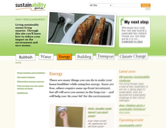
It’s about the experience…
While Provoke has a golden reputation for being leaders in Microsoft-driven solutions, this doesn’t restrict our dUX (Design & User Experience) team from crafting an awesome experience for other technology platforms. The most recently example is sustainability.govt.nz – with the information architecture, visual design and HTML/CSS templates created by Provoke (in close collaboration with the
-
auckland spoolfly buys lulu
In case you’re wondering what I’ve been up to recently, here’s a quick update… Fly Buying The new site has a fresh visual design and an improved user experience. This is the first stage of an ongoing programme of work so expect some further enhancements in future (and yes, we plan to fix the flickering
-
Unravelling Visual Design
At Provoke we’re increasingly focussing on visual design and how this influences a user’s comprehension of content, interactivity and pathways. Moments before unravelling…Coming up with a nice-looking visual design usually isn’t the greatest challenge – the real magic lies in the delicate interplay between the brand, content, navigation pathways, interactive tools and how the visuals
-
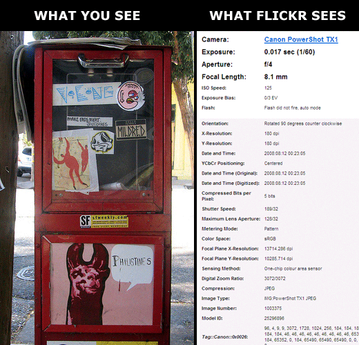
Gadget Neglect
Canon TX1 : Ingenious or insane – I’m not sure which…I’ve been so busy recently that my new (and first ever) digital camera sat unopened on my desk for 7 days… For just $NZ500 (plus an extra $80 for a 4Gb memory card) I’ve now got a camera which not only shoots stills, but also
-
FullCodePress : The Aftermath
On Saturday 18 August 2007, teams from Australia and New Zealand competed to build a fully-operational website for a non-profit organisation in 24 hours. No excuses, no extensions, no budget overruns… Press release below. Full coverage, including videos, photos and commentary, over at FullCodePress Code Blacks bring home the trophy Kiwi geeks win trans-Tasman 24-hour
-
FullCodePress : We Begin!
On Saturday 18 August 2007, teams from Australia and New Zealand will compete to build a fully-operational website for a non-profit organisation in 24 hours. No excuses, no extensions, no budget overruns…
-
FullCodePress : The Day Before
On Saturday 18 August 2007, teams from Australia and New Zealand will compete to build a fully-operational website for a non-profit organisation in 24 hours. No excuses, no extensions, no budget overruns…
-
FullCodePress : Getting There
On Saturday 18 August 2007, teams from Australia and New Zealand will compete to build a fully-operational website for a non-profit organisation in 24 hours. No excuses, no extensions, no budget overruns…
-
geeks gearing up for website olympics
It\’s not often that the geeks get to represent their country in a team sport. That\’s an honour usually reserved for the rugby types, the netballers, and the all-round action stars. More Photos But for seven self-confessed computer nerds, the embarrassment of always being picked last in PE is now a distant memory. This group
-
Press Release: Kiwi team gears up for Geek Olympics
On Saturday 18 August 2007, web teams from Australia and New Zealand will compete in Sydney to build a fully-operational website for a non-profit organisation in 24 hours.The All Blacks have held on to the Bledisloe Cup. Can our ‘Code Blacks’ match their success and come home winners? All will be revealed in the FullCodePress
-
I’m Full Code Press Ahead!
The wait is finally over! The following names from both teams were drawn from a hat*: The Australian team: Marla Mitelman – Project manager Ruth Ellison – User experience /IA Sarah Peeke – Designer David McDonald – HTML/CSS coder Rex Chung – Programmer Melissa Cater – Writer The NZ Team: Peter Johnston (Sorted) – Writer
-
We’ve Been Skin’n
The Provoke Design & User Experience team had some fun last week when we were given the opportunity to design some ‘skins’ for a beta of the new Sharepoint Community Kit blogging tool. The Community Kit for SharePoint is a set of best practices, templates, Web Parts, tools, and source code that enables you to
-
stuck in a reality distortion field
If you haven’t heard from me in recent weeks it’s because I’m stupidly busy, and when I get extra busy I often end up in a strange ‘reality distortion field’ where the busier I get the more I suddenly decide to take on. I don’t know if this is a sign of abject stupidity or
-
Helping Airlines Cope with Children
Qantas and Air New Zealand could greatly improve their online booking process when it comes to children who need to fly unaccompanied. There’s many reasons why children need to fly alone. Their parents might live in two different cities; a child might be going to spend the holidays with their grandparents; a child might be
-
Seeking User Experience Strategic Guru (E-Commerce)
Provoke has some exciting projects on the horizon and I’m keen to hear from (or about) any fantabulous e-commerce gurus out there (freelancers or full-timers). You might be the sort of person who could lead the research, strategy, requirements and information architecture of a large e-commerce and dynamic data-driven web site.
-
Reprasent!
The new few months are going to be busy in Wellington when it comes to conferences and presentations. This time I’m involved in a few myself…
-
Bring Your Personas to Life!
Most UCD (user centred design) companies now create personas – profiles of representative users – to guide their designs. After all, to do UCD you need to get the ‘U’ in focus right from the start. So you’ve got your persona set all neatly defined and documented, now what? How can you ensure the persona
-
I’m Hiring (Again…)
When you see the latest jaw-dropping feature from Flickr, 37signals, ZoomIn, TradeMe or [your favourite website], do you think, “how on earth did they do that”? Do you then dig around the browser code, scour the web, read the blogs and try and actually find out HOW they did it? Ever tried to DO it
-
Filtering Out Advanced Search
Last year I designed a prototype of an advanced search system for Student Job Search (SJS). I’d taken inspiration from the iTunes ‘smart playlist’ feature and created an ultra flexible tool for students to add multiple layers of search phrases and criteria. Then a few months ago SJS asked us to build the search for
-
I’m Hiring
Well, strictly speaking, Provoke is hiring… I’ve now been working as the Director of Design & User Experience at Provoke for just under two years – in that time my small team has been flat-out conducting user research, usability reviews, designing conceptual models, information architectures and interaction designs for webapps, mobile devices and folk songs.
-
BankDirect vs Kiwibank
It’s one of those strange things about my world – every time I criticise a company or Government department the next day they’re nominated for an award (or even actually win something). It happened with Statistics NZ and the Online Census and now it has happened with Kiwibank. Kiwibank wins 2006 Sunday Star-Times Cannex Banking
-
When the Web Was Young
Glimpses of zef[a]media between 1995 and 1999 – courtesy of the Wayback Machine… [Note: Wayback Machine isn’t perfect, some links and images are missing]. 1995 I’ve been scouring the archives to find versions of this website from 1994-95, but all I could recover was this logo… 1996/1997 This homepage wouldn’t pass usability tests these days!
-
Microsoft Bridging the Gap Between Developers, Designers and the User Experience
This article originally appeared on Digitalmelon, and is re-blogged here with the kind permission of Chandima Kulathilake. Chan has been recently evaluating new Microsoft technologies for User Interface Design – in what is just the start of Microsoft recognising interactive designers as integral to software – better enabling them to deliver an engaging User Experience.
-
Gold-plated Paper
Dealing in software design I often work with budgets worth many more times than my car (and sometimes as large as my 25-year mortgage). And because I often work in the early stages of web projects what I’m delivering to clients is usually nothing more than concepts on paper. When the end-product is merely conceptual
-
Statisfaction
A few months ago I kicked up a fuss about the usability and interaction design of the first New Zealand Online Census. Just having completed my own design projects for the SJS registration forms and E-Government compliance for Grants Online, I was surprised at how the Online Census differed so radically from what I considered
-
Bob’s Webstock Lyrics Uncovered!
In an exclusive scoop, Zef brings you the original lyrics from Bob’s legendary Webstock performance on May 25. Those who were lucky enough to be present at Webstock may notice a few differences from the improvised live performance, including “Flickr’d” substituted for “Google”, and “pointing device” exchanged for “mouse” – just like a good CSS,
-
Taking Stock…
Well – Webstock was a blast. Here’s snippets from my seven days of coffee and haze… Sunday (PM) I join the Provoke crew to wine and dine the phenomenally busy Kelly Goto. Monday Running a packed UPANZ event with Kathy Sierra + Bert Bates… Kathy gives us plenty of food for thought – Phil and
-
Google Trends is Misery
Google Trends is the new hot topic – but apart the fun it gives you (by comparing search terms), in most cases the information it spits out is quite useless. This is because Google can’t read our minds (yet). It doesn’t know the goal of the individual user, and the context of what they’re searching
-
To submit, submit or submit?
I’m sick to death of screens containing multiple submit buttons and in recent years I’ve been culling submit buttons from any web application I can lay my hands on. Most of the time users will click on ‘NEXT’ so there’s no need to offer extra buttons saying ‘BACK’, ‘SAVE’ or ‘CANCEL’My rule is simple… “One
-
‘Absolute Beachfront’ by 2050
What will New Zealand look like in 20 years if we don’t have fresh Water, are still dependant on Oil and human-induced Climate? A sea-level rise of 5m will make my house ‘absolute beachfront’.To debate this I recommend you subscribe to Future Blog – which has a focus on Wellington/New Zealand environmental issues. It’s well
-
Environmentally Friendlier Pop-ups
Old fossil Web1.0 technologies (such as pop-ups) continue to pollute our browsing environment and are hampering progressive and sustainable navigation. So, in one of my previous blogs I declared “War on Pop-Up Pollution“. In this issue I look at some alternative techniques to “display information within information”. Why Pop-ups Are Evil Forced Consumption’¦ According to
-
Meantime, in my day job…
Recent success stories from the Provoke coal face (where I manage a small team of interaction designers)… The National Bank of New Zealand’s new plastic fantastic personalised photo cards have been so popular that oil prices in New Zealand have shot up yet again. During beta-testing I cheekily tried submitting this cartoon of a rabbit
-
Online Census Flopped?
The online census attracted less than half the expected number the Dominion Post reported yesterday. Less than half the expected number of people filled out the new Online Census.The paper reported that Statistics NZ had hoped that 15-20 per cent of the population would complete the census online, based on dry runs conducted last year
-
Just “waiting for the real thing?”
Ever had a brilliant idea that could potentially ‘spice-up’ a business, the world wide web, or the planet? Like many creative people my great ideas often stay “just ideas”. They tend to languish and then fade away. Except, in my case they don’t always fade away – a few abandoned concepts have come back to
-
A Cultivated Census
In my blog a few days ago (about the poor design and usability of the New Zealand online Census), drew bundles of feedback and criticism from various quarters. Comments I received via email and on other websites included: Agreements… ” I have to agree with the blog – a simple URL is a lot easier
-
Holding the Online Census to Account
The online version of the New Zealand 2006 Census is littered with unnecessary design and usability issues. For the first time New Zealand citizens have the option of doing the census online – which is brilliant news. So I thought I’d give it a go. I was truly expecting a slick, web savvy and usable
-
Students Treated to Defensive Design
The Student Job Search website has been relaunched, but at first glance you wouldn’t notice much of a difference… While the visual design has largely remained untouched – most of the work has gone in to turning a potentially arduous registration process in to something digestable and usable for both students and employers. Provoke’s ethos
-
ZoomIn BloomIn Brilliant
Zoomin is a New Zealand dynamic street map site, where you can zoom, pan and navigate around the map in real time. Sound Googlesk? Well, it is, but better. What I really like about it is the user experience – it’s uncluttered and simple to use – minimal navigation and appropriate use of AJAX. And,
-
Radio NZ Rocks Online
I’m probably a tad younger than the core Radio New Zealand demographic, but in recent years it has become my station of choice – thanks in part to my fabulous retro 1950’s transistor radio (which only picks up the AM frequency). The station makes me feel connected to the flavour of New Zealand I identify
-
TV3 Website Gives Me Nightmares
Just when I thought the web was actually going through a revival with usability, web standards, AJAX taking hold – and New Zealanders actually starting to churn out some pretty decent websites – TV3 had to come along and trash the party. Obviously TV3′s web designers needed a ‘What’s Hot/What’s Not’ list – so I’ve
-
Down Traden
Are you paying too much when buying goods on Trade Me? All it takes to find out is a couple of Googles. Last July our juicer became redundant. That is, I was enthusiastically trying to clean out the hard-to-reach festering gungy bits of fruit pulp, and the thing just flew apart (I blame the designers
-
Foto Blotto
It was my first exploration into the brave new world of ordering photo-prints online. I thought the experience would be simple… Visit a website Upload a bunch of photos I want printed Choose the size and format Enter my address and credit card details Then forget about it a for a few days… …until “viola!”
-
Trade Me Your Region
The Trade Me ‘change my region’ feature assumes New Zealanders are hermits – never leaving the comfort of their internet device, home, street or town. I live and work in more than one region.The purpose of ‘change my region’ is to allow people to search for goodies in ‘their region’ (or, alternatively, over the whole
-
Designing for Loyalty
Astute web designers do more than just design with your customers in mind- they actually design with your customers- in person. Zef Fugaz looks at ways to get your users on board, and looks at New Zealand success stories. This article originally appeared in Unlimited Magazine (June 2004) The dotcom crash taught the young web
-
Kissing the Lips of E-govt
Achieving e-Government compliance for public sector websites will require a makeover that’s greater than skin-deep. Zef Fugaz looks at the realities of putting public service websites on the operating table and making them skip to an e-Government beat. Trevor has spoken. By 2006 all public service websites will have to be well and truly on
You must be logged in to post a comment.